Weak UX = Low Conversions | 3 common mistakes and how to avoid them
Many websites lose potential customers because their user experience is lacking. In this blog, we will show you three common pitfalls that can lead to a lack of conversions and provide specific optimization tips.
Imagine this: You visit a website because you want to buy a new pair of running shoes. Instead of being taken straight to the product, however, you are greeted by a huge pop-up asking you to sign up for the newsletter. Then, an animation loads slowly. When you finally reach the product page, you have to scroll through endless text, but you can't find the "Buy Now" button anywhere. The logical consequence? You leave the website and buy the running shoes somewhere else.
A lack of user-friendliness causes potential customers to leave. If a website is not intuitively designed, users will be distracted by unnecessary elements, and the purchase process will be too complicated. This will cause the conversion rate to drop drastically. We'll show you common UX mistakes that prevent visitors from converting and give you tips on how to avoid them to gain a competitive advantage.
BUT WHAT EXACTLY ARE “CONVERSIONS”?
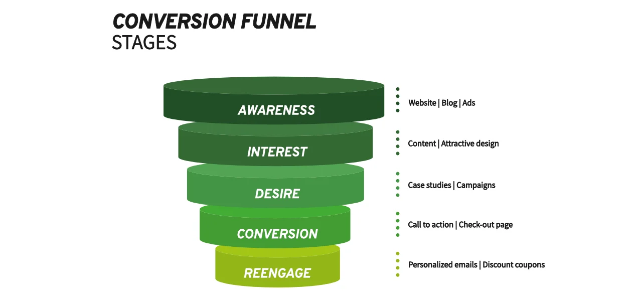
Quite simply, a conversion occurs when a visitor to your site takes a desired action, such as making a purchase, filling out a form, or subscribing to a newsletter. Any previously defined goal that is achieved can count as a conversion. A high conversion rate indicates that your website effectively turns visitors into paying customers or engaged users.

WHAT DOES THIS HAVE TO DO WITH “USER EXPERIENCE”?
Although conversions can be diverse, there are overarching guidelines to increase the conversion rate of your website. The conversion rate optimization of your website ensures that you achieve the best result for the effort you put into your website. A decisive success factor here? The user experience (UX). A poorly designed UX can drastically reduce your conversion rate, while an optimized UX can significantly increase it.
In this blog post, we'll look at three common UX problems that can ruin your conversion rate - and show you how to fix them.
3 reasons that are not optimal for your conversion rate from a UX perspective
We'll now show you 3 common mistakes that slow down your conversion rate - but there are many more reasons! Want to know what other mistakes can make your website unprofitable?
Download our free PDF now, which contains the 10 most common mistakes - including practical tips for optimization.

💡Tip 1: Maintain a clear storyline
A long page can be useful if it follows a clear storyline and leads the user step by step to conversion. Structured sections with a logical structure, from important to unimportant, help to guide the reader instead of overwhelming them with an endless wall of text. Large, clear headlines can provide orientation.
💡Tip 2: Always point out the conversion despite a long page
Place CTAs in several places on the page - ideally after each content unit. This ensures that users always have the opportunity to perform the desired action without having to search for a button.
💡Tip 1: Use clear and convincing labeling
Use specific and action-oriented CTAs like “Start your 14-day trial” instead of generic terms like “Learn more”. Add icons or subtexts to improve user guidance.
💡Tip 2: Set the focus on a primary CTA
Each page should have a clear main goal. Place the primary CTA clearly visible and repeat it in meaningful places. A reduced, secondary CTA can provide additional information, but should not distract from the main goal.
💡Tip 1: Use images selectively
Use authentic images with real people instead of just product photos. Use “directional cues”, i.e. lines of sight or arrows that unconsciously lead the user to the CTA.
💡Tip 2: Organize your text clearly
Keep headlines short and get straight to the point. Instead of general statements, focus on specific benefits for the user. Also use short sentences, paragraphs and formatting such as bolding or bullet points to make texts easy to understand.
CONCLUSION: THE BASIS FOR A SUCCESSFUL WEBSITE LIES IN USER EXPERIENCE
Optimizing your conversion rate starts with a well thought-out user experience. Clearly structured pages, precise CTAs and appealing content are essential for user-friendliness in order to turn your visitors into satisfied customers. However, if you are unsure whether your site is really working optimally or what specific changes are necessary, a usability analysis in the form of a UX audit is the next step.
A heuristic evaluation helps you to identify weak points in the user experience and make targeted improvements in order to achieve website optimization. This not only maximizes your conversion rate, but also offers your users a much more pleasant experience. Take the opportunity and get professional support from us to take the performance of your website to the next level!
We, Lemonize, offer you a free appointment for an initial consultation for a UX audit. We start the appointment with concrete suggestions for improvement based on an initial analysis of your website or app.